Visual editor
Design your invitations in a full editor with the interactive pieces built in: RSVP forms, countdowns, maps, save-the-date, QR codes, and an opening envelope. Then publish to a live page, nothing to install.
Invitarium is a full visual editor, and what sets it apart is that the interactive pieces of an invitation are built right in. You design the page and add a working RSVP form, a countdown, a map, all in the same place, then publish it to a live page. Nothing to install, and nothing to paste in from somewhere else.
Built around the invitation, not a blank page
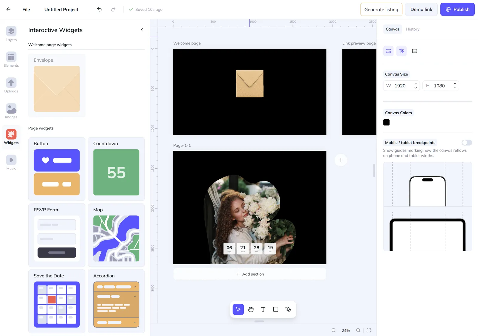
Most editors hand you an empty canvas and leave the rest to you. This one is built around the way an invitation actually lands, so the structure is already there before you place a single element. Your guests are met by a welcome page, the opening moment that sets the tone instead of dropping them straight into a wall of text. A link preview page hands you control over the very first thing people see when your link lands in a chat or a feed: a thumbnail you designed, not whatever the internet happened to grab. And because real invitations are rarely a single screen, you add as many pages as the occasion calls for and grow each one into a long, scrolling story built from stacked sections, so a quick save-the-date and a full multi-page suite live in the same project with the same tools. You set the canvas to any size you need and choose its background, then design without second-guessing how it will travel: phone and tablet breakpoints are already in place, marking how the layout reflows at smaller widths, so the design that wins on your monitor still looks right on the screen your guests actually open, with nothing to patch up afterward. It is the difference between fighting a generic tool and working in one shaped for exactly what you make.
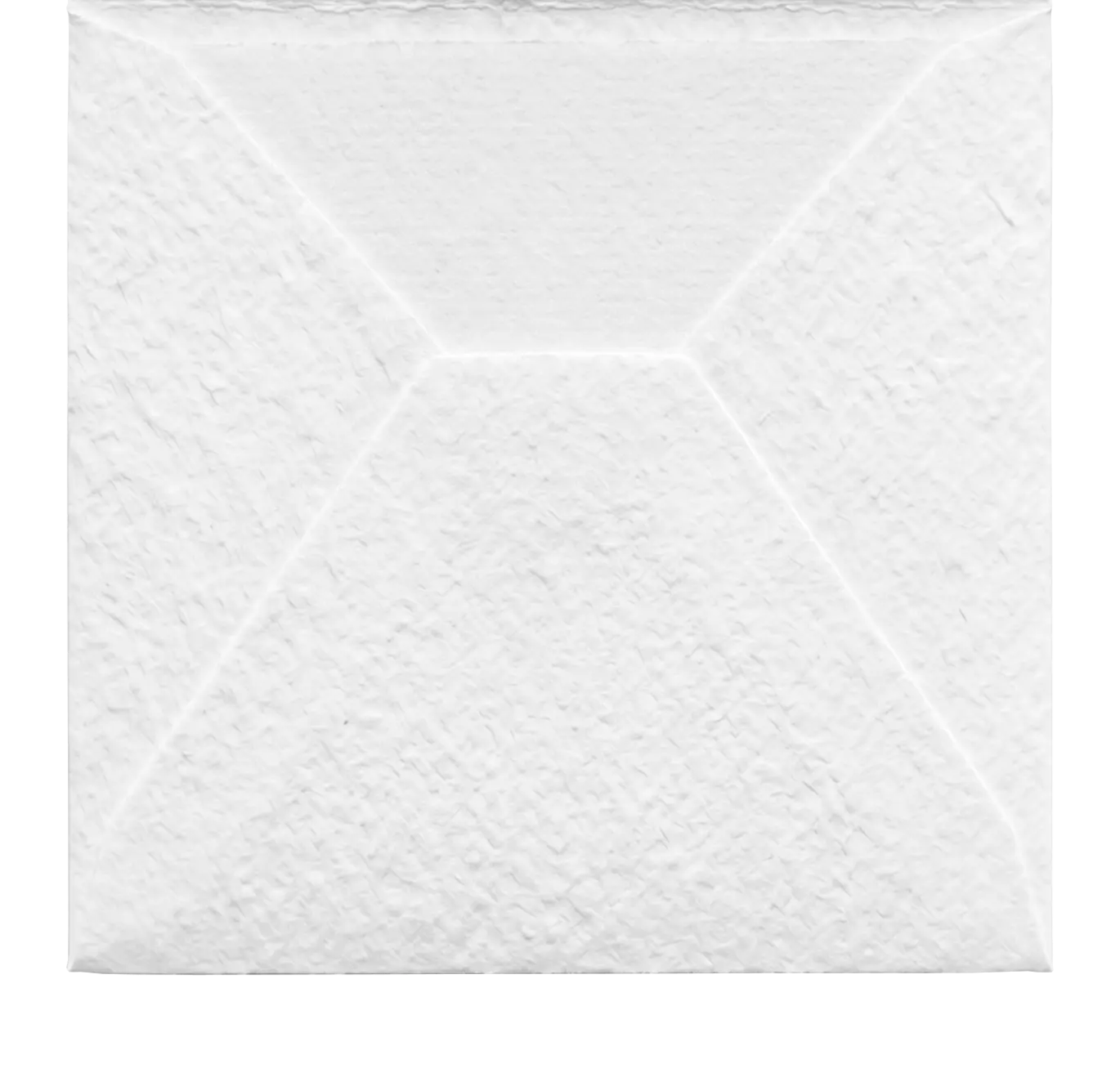
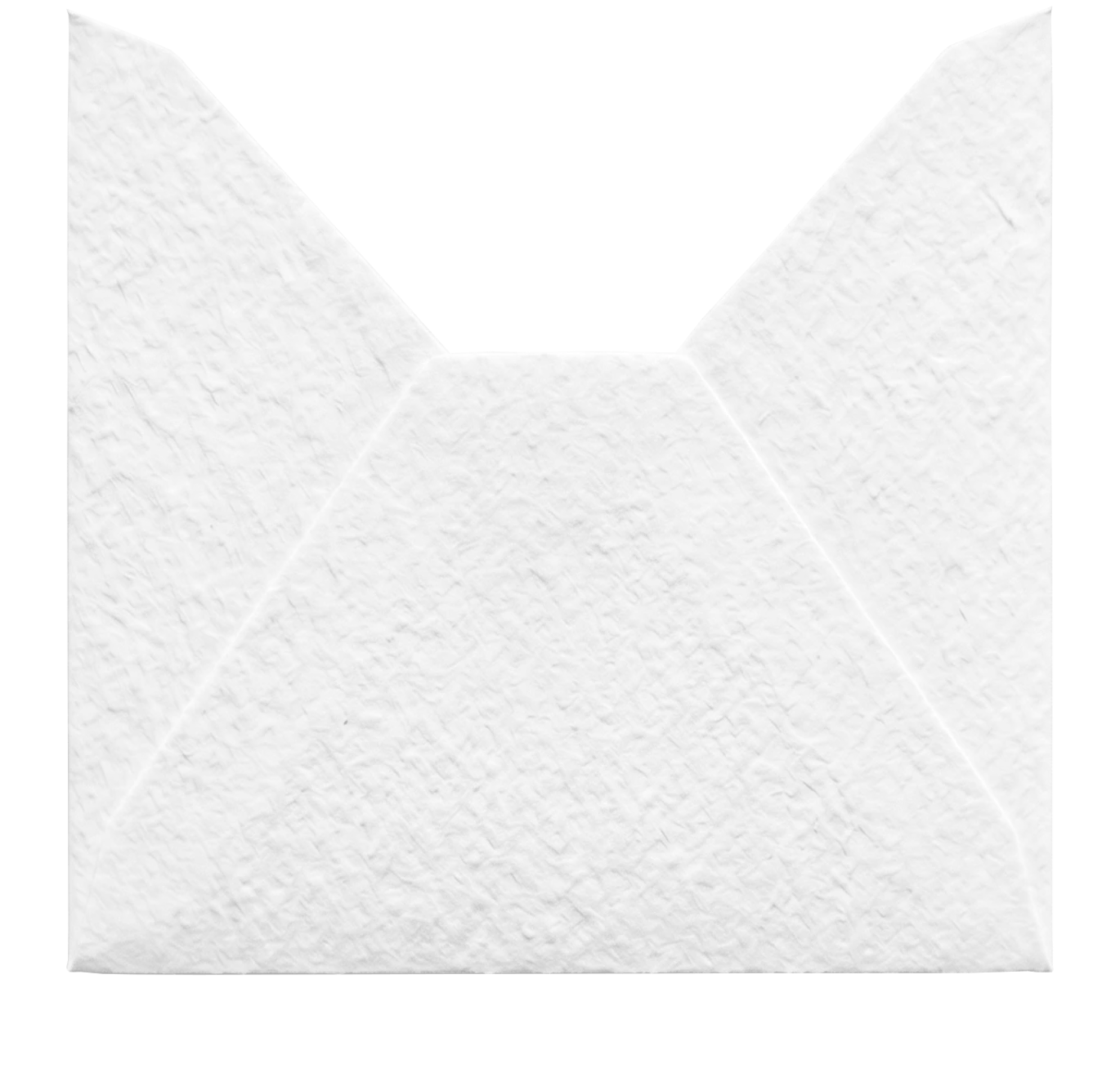
Draw your own frame, then pour a photo into it
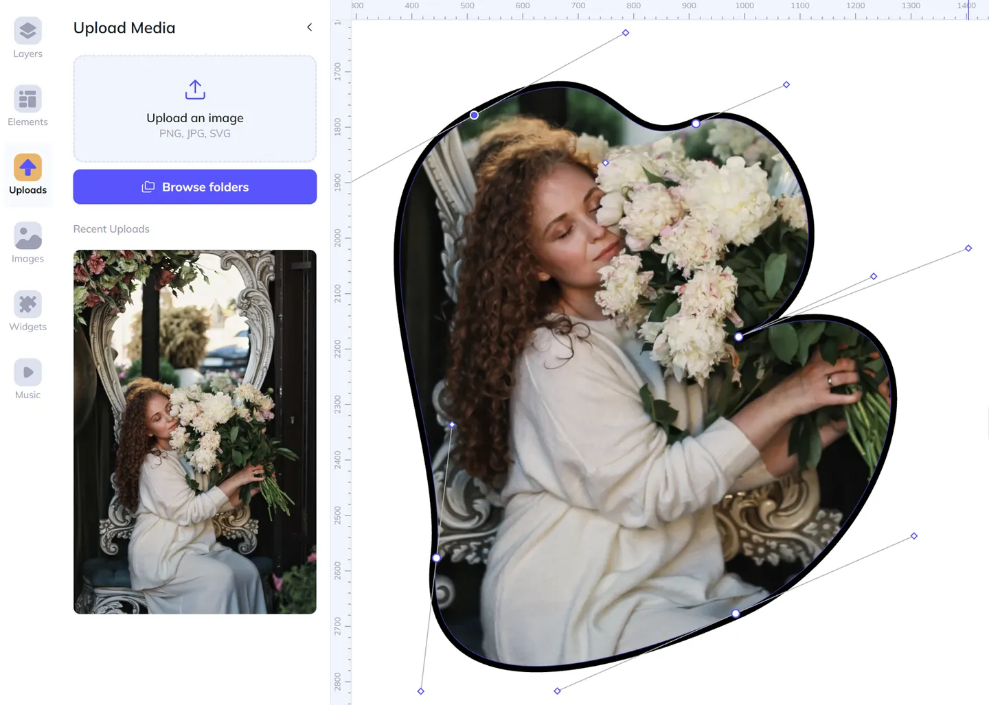
Most editors hand you a fixed set of frames and ask you to crop your photo to fit one of them. Here you do it the other way around: you draw the frame. With the pen, you place points and pull out handles to bend each segment into a smooth Bézier curve, an organic blob, a sharp geometric panel, a long ribbon down the side of the page, open or closed, whatever the design calls for. Close the path and it becomes a shape, and that shape can hold a photo. Drop in any image and it is clipped to the exact curve you drew, then you pan it, scale it and rotate it inside the shape until the crop sits just right. Give it a fill or a stroke to finish it, and come back any time to nudge an anchor or reshape a curve without starting over. It is the difference between fitting your photo to a template and shaping the frame around your photo, the kind of freedom a page full of preset frames can never give you.
Open with a real moment, not a static page


Envelope settings
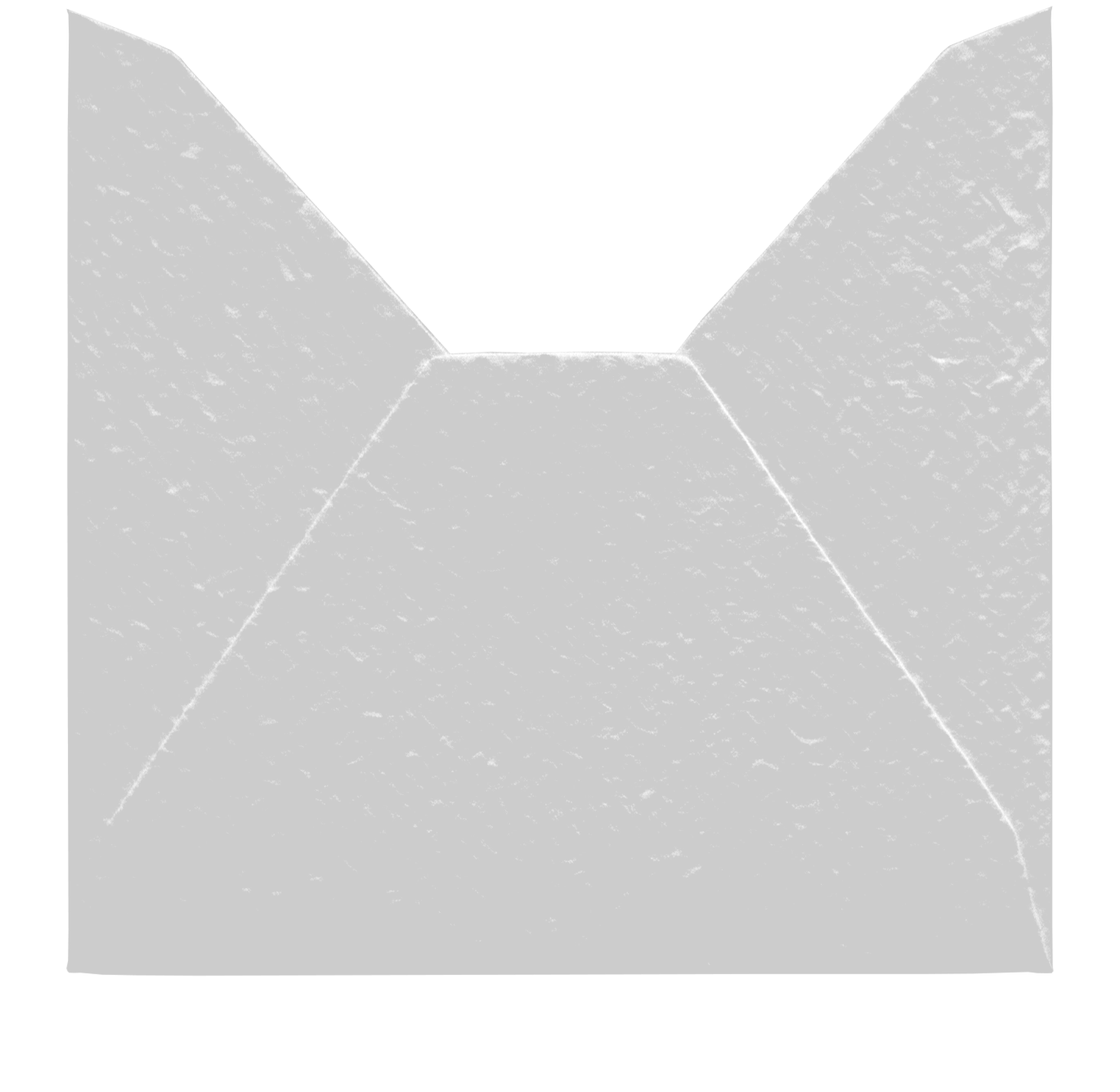
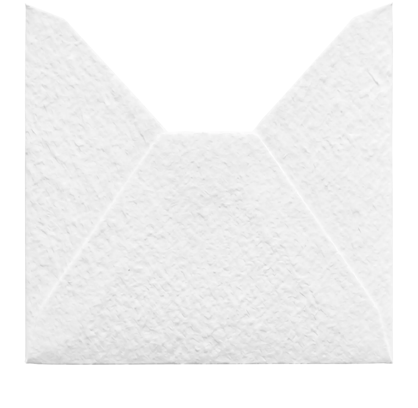
The welcome page can open with an animated envelope, and it is entirely yours to style. Set the colors of the envelope body, the flap, the liner, and the letter frame, and upload your own patterns to tile across the envelope and its lining, so it belongs to your suite instead of looking like a stock graphic. When a guest taps it, the flap lifts open, the letter rises up out of the envelope, and that same letter grows to become the first page of the invitation, one unbroken motion from a closed envelope to the design itself. On Android the page goes fullscreen as it opens, and the background music starts on that very tap, so the invitation arrives as a moment rather than a page that was just sitting there. And the envelope is only the start: more envelope styles are on the way, and the welcome page will grow to hold other openers made for every kind of event, not just one.
Count down to the day, live
Timer settings
More languages are coming soon.
Font Style
1,500+ fonts are available in the editor.
Units
More languages are coming soon.
Font Style
1,500+ fonts are available in the editor.
Units
A countdown turns a date into anticipation. Drop a timer onto the page, set the moment it counts down to, and it ticks live for every guest, right up to the day. Then make it yours: choose from eight styles, from clean Simple digits to Cards, Circular rings, a Slot-machine roll, or a Digital readout, decide exactly which units to show, from months down to seconds, and match it to your fonts and colors. The timer you set here is the one your guests watch on the published page.
Collect replies without leaving your design
Form settings
The RSVP form is a real, working form, not a picture of one. Build it from any mix of questions: a name, an email, a phone number, a short answer or a longer message, a dropdown, checkboxes or radio buttons with an optional "Other" box, and a special attendance question that asks the one thing every host needs to know. Mark a guest who can't make it, and the questions that only matter for people who are coming, the meal choice, the dietary notes, quietly fall away, a behavior you set per question so the form never asks for what it doesn't need. Every part of it is yours to style: switch between a light and a dark theme so it sits as comfortably on a bright page as on a deep, moody one, set the frame color and its corners, pick one accent that flows through the buttons and inputs, and choose the font, weight, size and color of the question text, the answers, the button, and the thank-you note your guests see after they reply. And because the form is part of the page and not a fixed image, it stays responsive: it fills the width you give it on a wide screen and reflows to fit a phone, the fields staying full-size and easy to tap instead of shrinking into something no one can read, and it grows and shrinks with its own content as guests work through it. Every reply lands in your dashboard, and you can have an email sent the moment one arrives.
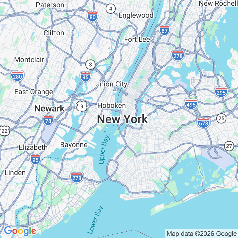
Show the venue on a map that matches your design
Map settings
A map answers the quiet question every guest has, where is this actually happening, and on the published page it is a real interactive map they can pan, zoom, and open in their own maps app to start directions. What makes it yours is that nothing about it is fixed. The map itself is fully editable: start from a ready style like Silver, Retro, Dark or Night, or go Custom and set your own colors for the land, the water, the roads, the parks, and the labels, so the map stops looking like a generic pin-drop and starts looking like part of your suite. Tune the zoom, hide the clutter you don't want, the points-of-interest markers, the road names, the transit lines, and restyle the pin itself, its shape and its color, to match the palette you have been building. It is not a map you tolerate next to your design; it is a map you redesign until it belongs to it. You set the address once in the editor and the map locks onto the spot, and an optional "Open in Maps" button gives guests one tap to navigation.
Turn one tap into a calendar reminder
Event
Date & Time
When clicked
The Save the Date button does the one thing that keeps an invitation from being forgotten: it puts your event straight into the guest's calendar. Fill in the details once, the title, the place, a short description, the start and end time in the right timezone, or flag it as an all-day event, and the button hands every guest a proper calendar entry, complete with a reminder a week ahead so the day doesn't sneak up on anyone. You decide what a tap does: drop the event straight into their device's default calendar, or open a small picker so they choose Google, Apple, Outlook, Office 365 or Yahoo. And like everything else on the page, the button is yours to shape. Rewrite the label, set the font, its weight, size and color, fill it with a solid color or a gradient, add a border and round the corners, adjust the padding, and add a small icon if it helps, so the one practical button on the page still looks like it was made for your design, not bolted on.
Answer the questions before they're asked
Every invitation gets the same handful of questions, what time, what to wear, where to park, can I bring someone. The accordion answers them all in one tidy place instead of a wall of text. Write each question and its answer, reorder them into the order that makes sense, and on the published page a guest taps a question and the answer slides open while the others stay closed, so the whole FAQ takes up just a few lines until someone actually needs it. And it carries your design rather than fighting it: switch between a light and a dark theme, set the frame's background and corners, pick one accent color that runs through the chevrons, the dividers and the border, and choose the font, weight, size and color of both the questions and the answers. Like the form, it is part of the page and not a fixed image, so it reflows to fit a phone instead of shrinking into something no one can read. It is the calm, scannable answer to the messages you would otherwise be replying to one by one.
A QR code that looks like it belongs
QR code settings
URL
Colors
Style
A QR code is the bridge from a printed card or a phone screen to anywhere you want guests to go: the live invitation, a registry, a playlist, a map, a folder of photos after the day. Point it at any link and it encodes instantly, right in the browser. Most QR codes look like the same harsh black grid stamped on everything, and that is exactly what you don't want sitting in the middle of a design you worked on. So this one bends to your palette: set the foreground and background colors, soften the dots from hard squares to rounded, dots, or a classy weave, restyle the corner eyes and their pupils, give the pupils their own color, round the corners of the tile and add padding, or drop the background entirely so the code floats transparent over your artwork. It renders as crisp vector on the published page, so it stays sharp whether a guest taps it on screen or scans it off a print, and it stays a clean, scannable code that happens to look like it was made for your suite.
More for sellers
- Listing StudioBuild the whole marketplace listing right next to your design. Mockups, an item video, and your listing copy in one place, then download it or push a draft straight to Etsy.Read more
- Share foldersShare one folder link and reach unlimited buyers. Each gets their own free, editable copy of every template inside, and you keep the relationship and the analytics.Read more
- Help-edit accessWhen a buyer cannot get their copy right themselves, or pays you to do it for them, they grant you access in a couple of clicks. You open their copy and edit it straight from your dashboard, with no links to chase and no files to resend.Read more